Navbar Generator
This navbar generator builds a responsive navigation bar with a working hamburger menu and gives you the code to paste into your site. Choose Tailwind CSS or plain CSS, type your logo text and links, pick three colors, and the live preview above redraws as you go. Select Copy code and you have one block of HTML, CSS (for plain CSS) and JavaScript. It runs in your browser and nothing you type is uploaded.
How to make a responsive navbar with a hamburger menu
Set Framework first: Tailwind CSS is the default,
Vanilla CSS gives you a standalone style block. Then fill in
Logo text (up to 30 characters; leave it empty and the brand link is left out) and
the Links box. Write one link per line, or paste a comma-separated list such as
Home, About, Services, Contact. Up to 10 links are used, and the counter under the box
tells you when you have gone over. When the preview looks right, select Copy code
and paste the result into your page. The Generated code block at the bottom shows
exactly what is copied.
Every link is <a href="#">, so replace each # with the real page
address once the code is in your project.
Try the mobile menu on a desktop screen
The Live preview has a Mobile and a Desktop button. Choose Mobile to see the narrow layout and click the hamburger icon to open and close the menu, even if you are working on a wide monitor. Choose Desktop to see the links in a row. The preview is drawn from the same code that you copy, inside an isolated box, so your own page styles cannot change how it looks.
Navbar generator for Tailwind CSS or plain CSS
The two framework options produce the same navbar in two forms.
| Tailwind CSS | Vanilla CSS | |
|---|---|---|
| What you copy | The <nav> HTML and a <script> | A <style> block, the <nav> HTML and a <script> |
| Styling | Utility classes such as hidden md:flex and md:hidden, colors as bg-[#ffffff] | Scoped classes: navbar, navbar-inner, navbar-brand, navbar-toggle, navbar-menu, navbar-link |
| Menu open state | The script toggles the hidden class | The script toggles the is-active class |
| Your page needs | Tailwind CSS v3 or later with its default base styles | Nothing else, no libraries |
Both versions switch at 768px, which is Tailwind's md breakpoint, so a project that
moves from one to the other behaves the same.
Logo left or logo centered: the two layouts
Layout offers Logo left, links right and Logo center, links below. On a wide screen the first puts the brand on the left and the links on the right. The second stacks the brand above a centered row of links. On a phone both look the same: the brand on the left, the hamburger on the right, and the links stacked at full width when the menu is open, so the page never scrolls sideways.
Change the navbar colors
Open Advanced styling to set Background, Text
and Link hover. Each row has a color picker and a hex box that takes 3 or 6 digits
(for example #fff or #1f5eff). The defaults are #ffffff,
#111827 and #2563eb. A value that is not valid hex is flagged and the
last good color stays in use.
What the generated code includes
The markup is semantic HTML5: a <nav> with an aria-label, and a
<button> with aria-expanded and aria-controls that point
at the menu list. The script is about seven lines of plain JavaScript that opens and closes the menu
and keeps aria-expanded in step. It has no dropdown submenus, no sticky or fixed
positioning, no hover-open menus, and no React or Vue version. Add those yourself if you need them.
Frequently Asked Questions
How do I make a responsive navbar in HTML and CSS?
Choose Vanilla CSS under Framework, enter your logo text and links, then select Copy code. You get a style block, a nav element and a short script in one piece. Below 768px the links collapse behind a hamburger button; from 768px up they sit in a row. Paste the block into your page and replace the placeholder # links.
How do I make a responsive navbar with Tailwind?
Leave Framework on Tailwind CSS, set your logo, links and colors, and select Copy code. The nav uses utility classes such as hidden md:flex and md:hidden, with your colors as arbitrary values like bg-[#ffffff]. Your page needs Tailwind CSS v3 or later with its default base styles, and the file you paste into must be one Tailwind scans for classes.
How do I make a hamburger menu in HTML and CSS?
The generator writes one for you. The hamburger is a button with an inline three-line SVG icon, aria-expanded and aria-controls. A script of about seven lines flips a class on the menu when the button is clicked and updates aria-expanded. In the preview, switch to Mobile and click the button to try it.
How do I make a navbar responsive using a media query?
With Vanilla CSS selected, the generated style block is mobile-first: the menu is hidden by default and a min-width: 768px media query turns it into a row and hides the hamburger button. The Tailwind output does the same with the md: prefix, which is Tailwind's 768px breakpoint.
How do I change the navbar color in CSS?
Open Advanced styling and set Background, Text and Link hover. Each row has a color picker and a hex box that accepts 3 or 6 digits. In Vanilla CSS the values appear in the .navbar and .navbar-link:hover rules; in Tailwind they appear as bg-[#hex], text-[#hex] and hover:text-[#hex]. The defaults are #ffffff, #111827 and #2563eb.
Can I make the navbar work without JavaScript?
Not with this generator. The hamburger needs the short script to open and close the menu, and it is included in the copied block. On screens 768px and wider the links show in a row without any script, but below that the menu stays closed until the button is clicked.
Why is my hamburger menu not working?
Check that the script sits after the nav element, as it does in the copied block, and that the button still has id navbar-toggle and the list still has id navbar-menu, because the script looks them up by those ids. Only one navbar per page works with the default ids. With Tailwind, also make sure the file holding the classes is one Tailwind scans.
Recommended
-
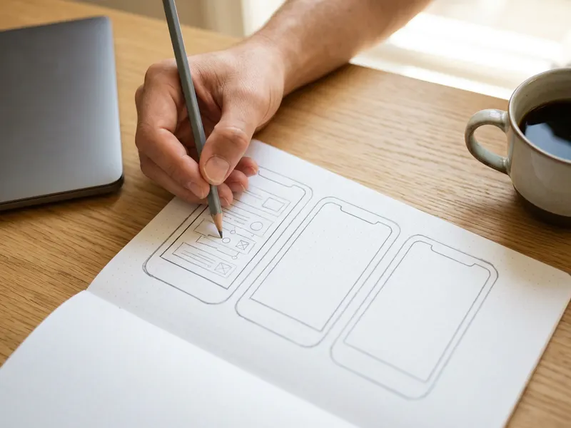 UX/UI Wireframe Sketchbook
Sketch the logo, links and menu order on paper before you generate the code.
-
 Amazon Fire HD 10 Tablet
Open the live page on a real tablet and tap the hamburger to be sure it works.
-
 Anker 7-in-1 USB-C Hub
One hub gives your laptop an HDMI port and card slot for the second screen you test on.
Helps keep the tools free. ✨
Images are for illustration only. As an Amazon Associate I earn from qualifying purchases.


